Last week I posted about taking spencer-taylor.com off WordPress and rebuilding it as plain HTML. The most interesting comments I received on social media weren’t about static versus WordPress. They were about the Google PageSpeed Insights score, and they showed me that a lot of developers, not just clients, misread what that number is.
One comment summed it up: “If you’re getting 100% on performance, it’s as fast as you can get. It’s as simple as that.” It isn’t, and the reason matters for anyone who uses that score to judge a site, pick a host, or decide whether a performance project was worth doing.
The PageSpeed score is an index, not a measurement
PageSpeed Insights runs Lighthouse, and Lighthouse builds the Performance score in three steps. It measures five metrics. It converts each one into a 0–100 score using a curve calibrated against real-world data from the HTTP Archive. Then it weights them and rounds the result.
Metric weights in the current Lighthouse version
Total Blocking Time 30% · Largest Contentful Paint 25% · Cumulative Layout Shift 25% · First Contentful Paint 10% · Speed Index 10%
The calibration is the part people miss. A metric sitting at the median of the web maps to a score of 50. A metric around the top 8% of the web maps to 90. So the score is a percentile against other websites, not a time. A 50 means “about average.” A 90 means “better than roughly 92% of what’s out there.” Nothing about it is in seconds.
Why two sites at 100 are not the same site
Because the curve is a percentile, it flattens out at the top. Once every metric clears the “good” control point, further improvements produce smaller and smaller score gains, and anything past a certain point rounds to 100.
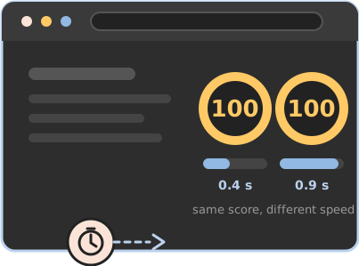
That makes 100 a ceiling, not a value. A page that paints its hero image in 0.4 seconds and a page that takes 0.9 seconds can both show a perfect score. The score has no resolution up there, by design.
If you want to compare two fast sites, the score is the wrong tool. Open the metrics underneath it. That’s where the difference lives.
Time to first byte isn’t in the score at all
This is the strongest single argument against “100 means as fast as it gets.” Time to first byte, or TTFB, is how long your server takes to start sending a response. It reflects your hosting, your stack, your caching, and whether a database and PHP sit between the request and the page. It’s the metric that most directly measures what you’re paying a host for.
PageSpeed Insights reports it as a diagnostic. It carries zero weight in the Performance score. Two sites can both show 100 with TTFBs of 80 ms and 600 ms, and the green circle will not move. Your visitors feel that half-second on every single page load.
The Lighthouse performance score is not what Google ranks you on
The score is a lab test. Lighthouse loads your page on a simulated mid-range Android phone over a throttled connection, from a Google datacenter. It’s repeatable and useful for diagnosis, but nobody actually visits your site that way.
What Google uses for its page experience signal is Core Web Vitals from the Chrome User Experience Report: real Chrome users on real devices over the previous 28 days. That’s the “Discover what your real users are experiencing” panel at the top of the PSI report, and most people scroll straight past it to the big number.
So does page speed affect SEO? Yes, through Core Web Vitals in the field. The lab score itself is not a ranking factor. A site can score 95 in the lab and fail Core Web Vitals in the field, or pass in the field with a lab score in the 70s.
Ten points at the top is not ten points in the middle
The scoring curve is log-normal. Scores are roughly linear from about 50 to 90 and then squeezed hard. Going from 50 to 60 might mean cutting a full second off LCP. Going from 96 to 100 might mean cutting 100 milliseconds.
That’s why chasing the last few points is usually the worst return on effort in web performance. The work that moves a site from 60 to 90 changes what visitors experience. The work that moves it from 97 to 100 often changes only the badge.
The score moves even when the site doesn’t
Run the same URL five times and you’ll get five different numbers. Routing between you and the server, server load at that moment, third-party scripts, ads, and which Google datacenter happened to run the test all shift the result. Google’s own documentation says to treat the score as a distribution rather than a single value. One run is an anecdote.
What to look at instead
Field data first. The Core Web Vitals panel at the top of the report is your real visitors, and it’s the only part Google’s ranking systems care about.
Then the individual lab metrics, especially LCP and TTFB, because those tell you where the time is going. LCP is mostly your page, TTFB is mostly your server, and a slow site usually has a problem in one of the two.
Keep the score for what it’s good at: a quick sanity check, a client-friendly summary, and a way to catch a regression. It’s a bad tool for comparing two fast sites, and a worse one for deciding whether a performance change was worth making.
My static site and a well-tuned WordPress site can both score 100. Mine went from 78 to 98–100 on mobile when I rebuilt it, and the number was never the point. The point was LCP at 1.35 seconds, CLS at zero, eight requests, and a server that answers before a database is involved. The badge was never designed to tell you any of that. The full case study has the numbers, including where static falls short.